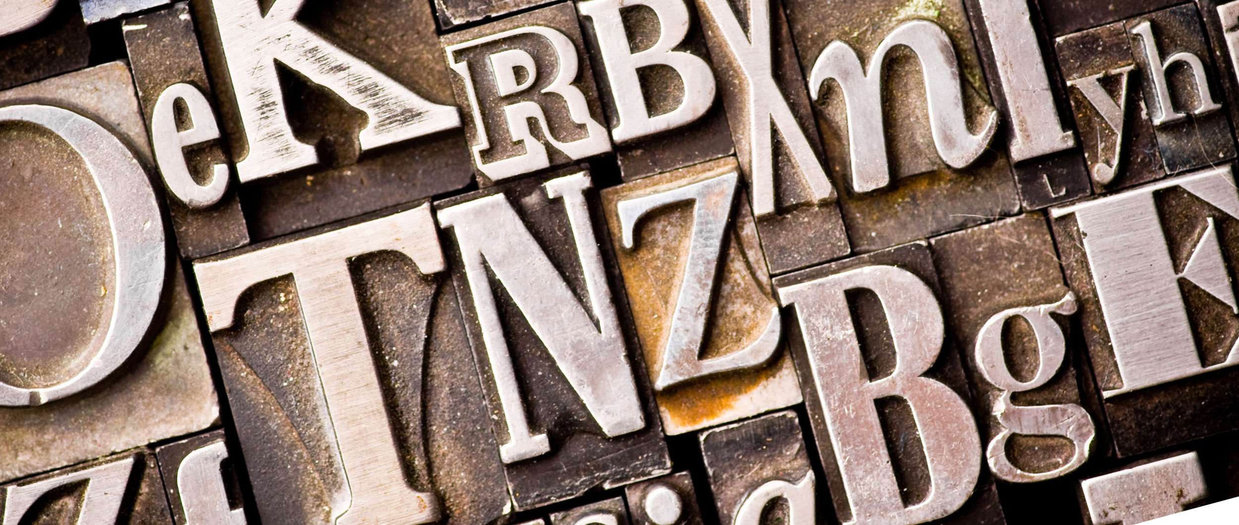
"Type is 95% of design - it's the driving force of all visual communication."
Type is everywhere, whether you notice it or not! It's the driving force of all visual communication and choosing the right type can deeply influence the effectiveness of communication and how it is perceived.
Choosing an appropriate type is fundamental for helping set the tone of a piece (as well as composition and colour). There are many reasons why some fonts go well together and why some don't. It's also good to bear in mind that the type you have chosen may not always stand alone, so always try to find a good partner for it.
I often choose fonts which are clean: and classic, my favourite pairing currently is Gotham and Times Italic (modern, clean and easy to read). Mixing serif typefaces with sans serif ones is a classic combination and by far one of the most popular trends in type: it's pretty much impossible to get wrong!
Not all fonts work well together as you can see from the below example (using: Gotham and Jenna Sue) so choosing a good secondary font is just as important. Achieving proper font pairing relies on concord and contrast. The fonts need to work well together, share similar qualities or be different enough not to conflict but complement each other.
Here are a few pointers to take into consideration when choosing a type:
- Does it come in a variety of weights?
- How readable is it?
- Does it pair well with other typefaces?
- Is there a clear hierarchy between typefaces (if you are using more than one)?
- Does it set the right tone and mood for the communication?
And finally once you know the basic rules of type don't be scared to break them once in a while!
